
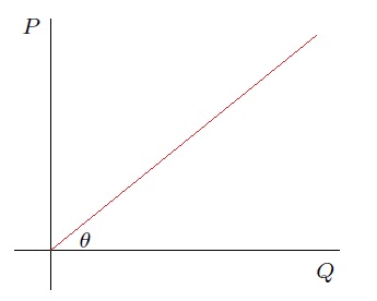
“Straight-Line-Graph-Through-The-Origin”
The words of Mr Michael Twomey, physics teacher, in Coláiste an Spioraid Naoimh, I can still hear them.
There were two main reasons to produce this straight-line-graph-through-the-origin:
- to measure some quantity (e.g. acceleration due to gravity, speed of sound, etc.)
- to demonstrate some law of nature (e.g. Newton’s Second Law, Ohm’s Law, etc.)
We were correct to draw this straight-line-graph-through-the origin for measurement, but not always, perhaps, in my opinion, for the demonstration of laws of nature.
The purpose of this piece is to explore this in detail.
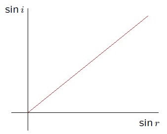
Direct Proportion
Two variables 


In this case we say 


Now imagine a plane, with 


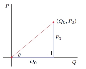
The tangent of this angle 

however by assumption, 

Similarly, any other point 


Consider again the graph with the right-angled triangle. The slope of a line is defined as the rise-over-the-run: aka the tangent of the angle formed with the
Measurement using the Straight-Line-Graph-Through-The-Origin
If we have two quantities that are in direction proportion… we need an example:
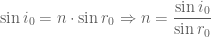
Example: Refractive Index
When a light travels from a vacuum into a medium, it bends:
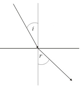
[image robbed from Geometrics.com and edited]
It turns out, using Maxwell’s Equations of Electromagnetism, that 


This constant of proportionality, 
For the moment, make the totally unrealistic assumption that we can measure 


This, however, is completely unrealistic. We cannot measure without error (nor calculate without error).
Recall again that 
This line represents the true, exact relationship between 
In the real world, any measurement of
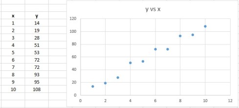
For example, suppose, for a number of values of 


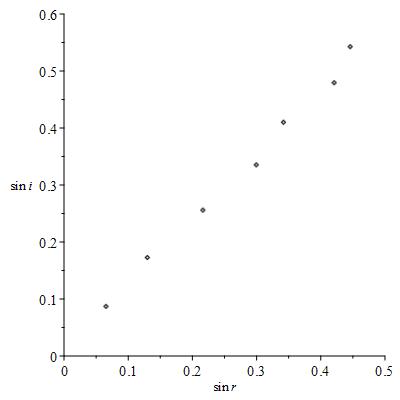
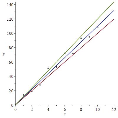
Now these errors in measurement and calculation mean that these points do not lie on a line. Teaching MATH6000 here in CIT, would see some students wanting to draw a line between the first and last data points:
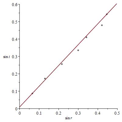
We can get the equation of this line, it’s not too difficult, and the slope of this line approximates the refractive index (we get 
When we do this we are completely neglecting the following principle:
Data is only correct on average. Individual data points are always wrong.
The second statement should be self-evident: individual data points contain errors and are certainly wrong. When we are not dealing with discrete data, but continuous data this statement always wrong can be quantified (in the sense of almost always).
The first statement is a little more difficult, on relies the Law of Large Numbers, but for the purposes of this piece, just suppose that the errors are just as likely to be positive (under-estimate) as negative (over-estimate), then we might hope that errors cancel each other out — and we might expect furthermore that the more data we have, the more likely that these errors do indeed cancel each other out — and the data correct on average.
So using just two data points is not a good idea: we should try and use all seven. You can at this point come up with various strategies of how to draw this line, this line of best fit. Maybe you want to get just as many points above the line as below for example.
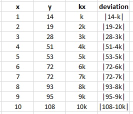
Recall individual data points always contain errors. So for example, we try and measure
It turns out, if we make assumptions about these errors (for the purposes of this talk errors are just as likely to be positive as negative), that if we have many, many data points, they scatter around the true relationship between
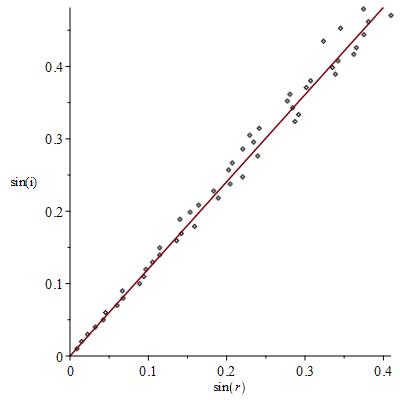
The errors have the property, that the sum of the vertical deviations – squared – is as small as possible. We explain with a picture what vertical deviation means:

The vertical deviations, briefly just the deviations, are as shown.
Now we flip this on it’s head. If we have some data we know that the line of true behaviour is such that if we had lots of data the sum of the squared deviations would be as small as possible.
Therefore, if we find the line that has the property that the sum of squared deviations for our smaller sample of data is a minimum, then this, line of best fit, approximates the line of true behaviour.
line of best fit 
The more data we have (subject to various assumptions), the better this approximation.
Now how do we find this line of best fit? An example shows the way:
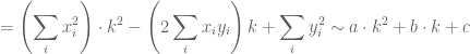
The quest is to find the line such that the sum of the squared deviations is as small as possible. As we note above, if 


How we find this line of best fit is to consider


and then minimise the value of 


Now note that 

A little time later we have, in this case,

How to minimise this? If you know any calculus this is an easy problem, however a rudimentary knowledge of quadratics is enough to help us find the minimum. All quadratics 

This is minimised when 

I wouldn’t ordinarily be an advocate for rounding fractions like this, however the important approximation
line of best fit
means that we cannot be so prescriptive. We finish here with

More generally, where we have 


so that as before, the quadratic


Verifying Laws
Maxwell’s Equations imply Snell’s Law but Snell’s Law was proposed almost 1000 years before Maxwell!
Suppose you hear about Snell’s Law for the first time. How could someone convince you of it (without running the gamut on Maxwell’s Equations!)
Well, they’d have to do an experiment of course! They would have to allow you measure different values of 
Then you would find the line of best fit: straight-line-graph-through-the-origin.
You would see the data lining up well, providing qualitative evidence for
Then they might show you how to calculate how well the data fits the line of best fit, perhaps by calculating the correlation coefficient.
Beyond
Things get slightly more complicated if we have a straight-line-graph that doesn’t go through the origin. Or a different curve than that of a line. We are however able to to fit data to a family of curves, curves that minimise the sum of the squared deviations. This is Linear Least Squares where partial differentiation can help find the curve-of-best-fit that approximates the curve-of-true-behaviour.
Things get more and more complicated after this but we can leave it there now.

Leave a comment
Comments feed for this article